
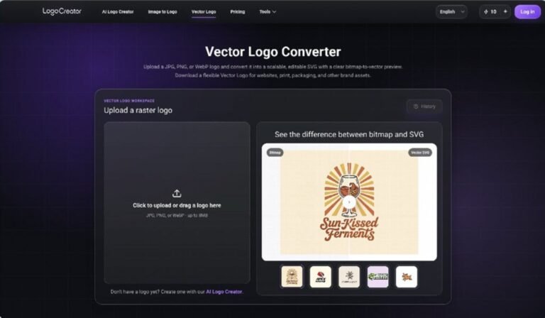
A logo can look perfectly acceptable in a website header and still fail when it reaches a printer, sign maker, packaging supplier, or event producer. The problem is often not the design itself. It is the file format. A small PNG or JPEG contains a fixed grid of pixels, so enlarging it can reveal soft edges, uneven curves, and fuzzy type. A Vector Logo Converter gives small teams a practical way to turn an existing bitmap mark into scalable artwork without treating the process as a complete redesign. The resulting Vector Logo can support larger and more varied applications while preserving the identity people already recognize. For founders and marketers, understanding this distinction early prevents rushed asset requests, inconsistent recreations, and unnecessary friction with outside partners.
Why a Vector Logo Solves More Than a Size Problem
Raster files are built for specific dimensions. They may work well in an email signature, social profile, or product interface, but every pixel becomes more visible as the image grows. A Vector Logo is built from paths and shapes instead. Those instructions can be rendered at many sizes, which makes the artwork more flexible for both digital and physical use.
This flexibility matters because a brand rarely stays in one channel. A new company may begin with a landing page, then add presentation slides, printed cards, event graphics, stickers, or merchandise. If the team owns only a small bitmap, each new use becomes a design exception. With a Vector Logo available, the same core mark can move between those contexts with fewer compromises.
A Vector Logo Is Also a Better Handoff Asset
The benefits are especially clear when work moves outside the founding team. Printers, fabricators, motion designers, and packaging partners often need clean shape data rather than a compressed image. Sending a Vector Logo reduces ambiguity because the recipient can work from defined outlines instead of tracing a blurry preview.
That does not mean every vendor should freely change the design. It means the team can provide a production-ready source while keeping a clear approved version. The asset becomes easier to reproduce, and the visual result is less dependent on someone making a hurried approximation.
Check the Source Before Converting
Conversion quality depends on the source file. Before creating a Vector Logo, locate the cleanest version of the mark your team has. Choose the largest available image, preferably one without screenshots, textured backgrounds, heavy compression, or added shadows. A clean source gives the conversion process clearer boundaries to interpret.
Also confirm that the bitmap represents the current approved logo. Early-stage folders often contain several similar drafts with small differences in spacing, color, or lettering. Turning the wrong draft into a Vector Logo can make an outdated version look official and spread it across future materials.
Inspect Edges, Type, and Negative Space
Zoom in before conversion and look at the parts most likely to cause trouble. Thin strokes may disappear, rounded corners may become uneven, and small gaps may close. Letterforms deserve special attention because compressed type can be mistaken for an illustration and converted into irregular shapes.
Negative space is equally important. The open area inside a symbol or between letters often carries the character of a mark. A useful Vector Logo should preserve those spaces rather than filling or narrowing them accidentally. This review gives the team a short list of details to check after conversion.
Separate Conversion From Redesign
It is tempting to fix every visual issue at once, but conversion and redesign are different decisions. The first goal is to reproduce the approved mark accurately as a Vector Logo. Strategic changes to typography, proportions, or symbolism should happen in a separate design review with a clear reason.
Keeping those tasks separate makes approvals easier. Stakeholders can first confirm that the converted asset matches the current identity. If improvements are needed later, the team can evaluate them deliberately instead of discovering unapproved changes during production.
Test the Converted Asset in Real Conditions
A successful Vector Logo should do more than look sharp at high zoom. Test it at the smallest and largest sizes your team expects to use. Place it in a website header, shrink it to an avatar, enlarge it on a slide cover, and preview it on a simple sign or print layout.
These tests reveal issues that a single artboard cannot. A detailed symbol may become crowded at small sizes even when its paths are technically correct. A very thin line may disappear in print. A converted gradient may behave differently across software. Reviewing the Vector Logo in context helps distinguish conversion errors from limitations already present in the original design.
Compare It With the Approved Bitmap
Put the converted file beside the source and compare the silhouette, alignment, spacing, and color. The Vector Logo should feel like the same identity, not a close interpretation. Check distinctive corners, unusual letter shapes, and the relationship between the icon and wordmark.
Ask one person who knows the brand well and one person who does not to review the comparison. The first person may notice subtle inconsistencies, while the second can judge whether the result still reads clearly. This small review is often enough to catch problems before the asset reaches a vendor.
Build a Simple Asset Package for Future Use
Once the Vector Logo passes review, organize it so the team can actually find and use it. Keep the master vector file in a clearly named folder alongside approved bitmap exports. Include a primary full-color version, a one-color version, and any approved horizontal or symbol-only variation.
File names should describe what each asset is for. Labels such as “primary-color,” “one-color-dark,” and “symbol-only” are more useful than “final,” “final-2,” or “newest.” The Vector Logo should be treated as a controlled brand asset rather than another loose attachment in a chat thread.
Create a short note covering minimum size, clear space, approved backgrounds, and who can authorize changes. These rules do not need to become a large brand manual. Their purpose is to stop avoidable misuse and help collaborators choose the right file without guessing.
The strongest outcome is not merely a sharper file. It is a cleaner handoff system. A well-reviewed Vector Logo gives small teams a dependable master asset for websites, presentations, print, packaging, and future creative work. By starting with the best source, preserving the approved design, testing real applications, and organizing the final files, a team can solve scaling problems before they turn into urgent production issues. That preparation keeps the brand consistent as its reach expands, without forcing every new partner to rebuild the mark from scratch.
